Colgate.com: Turning Content Traffic into Meaningful Commerce
TL;DR
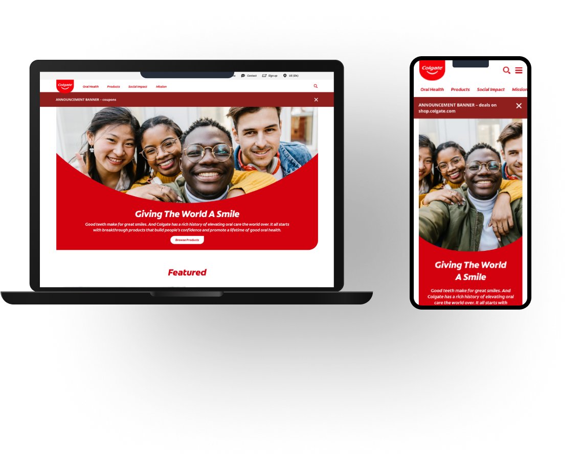
I led the redesign of Colgate.com's content and commerce experience to reduce confusion, improve discoverability, and turn oral health education into meaningful conversion. Through global user research, IA restructuring, and iterative testing, we increased engagement and conversion while addressing broader issues of dental health equity.
The Problem
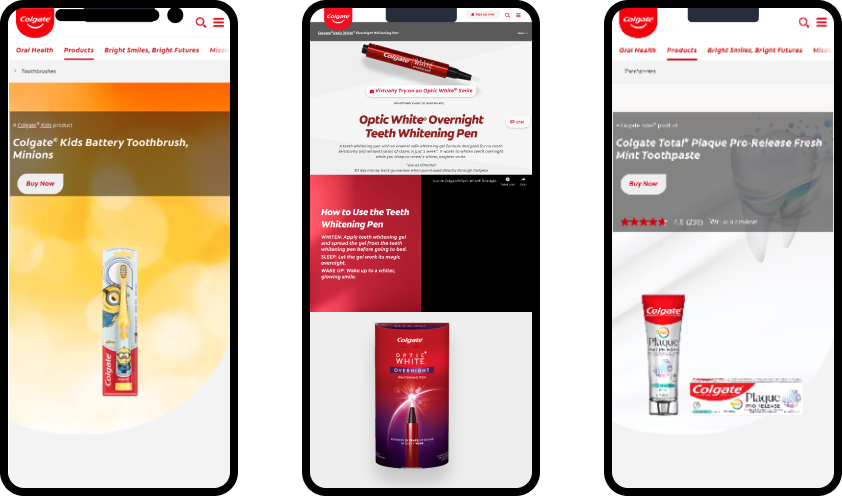
Colgate.com had massive traffic but low commercial impact. Users bounced heavily from educational content, navigation was unclear, and stakeholders couldn't articulate how the site actually helped users or the business.
At the same time, dental misinformation online disproportionately affects underserved communities, making trust and clarity critical.
My Role & Leadership
Lead UX Designer
- Owned research, information architecture, and end-to-end UX
- Introduced user testing to a stakeholder group unfamiliar with its value
- Worked cross-functionally with content, engineering, and global markets
Key Insight:
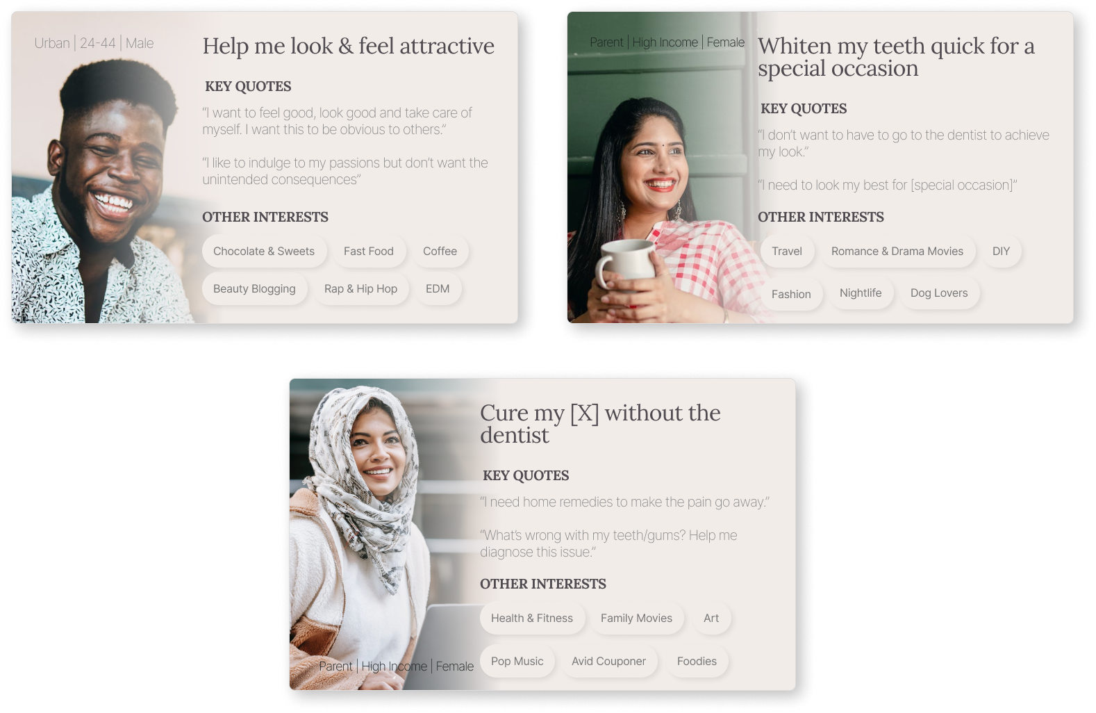
Teeth whitening was the most important issue in the US, UK, France, and Germany. But in Mexico, Brazil, India, acute dental problems like cavities, gum disease (gingivitis), and plaque were more important to users.
- Users weren't "just browsing."
They were actively seeking trustworthy dental guidance, often before making purchasing decisions - especially parents and users without regular access to dental care.
- The site failed not because of content quality, but because:
- Topics were poorly grouped
- Navigation imposed arbitrary mental models
- Educational journeys didn't connect naturally to products
What I did
Rebuilt the Information Architecture
- Audited 50+ oral health topics
- Ran card sorts across 7 countries with novice and expert users
- Discovered no consistent mental model → abandoned forced categorisation
Instead, I introduced:
- An A-Z topic index
- Clear topic labelling
- Search-first discovery
Tree testing showed:
- Lower abandonment
- Faster task completion
- Higher confidence
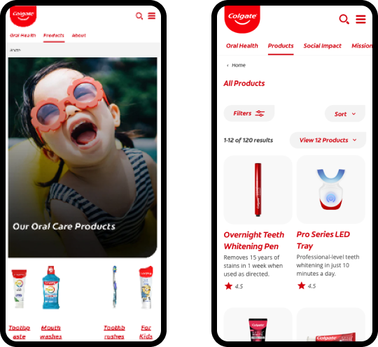
Connected Content to Commerce
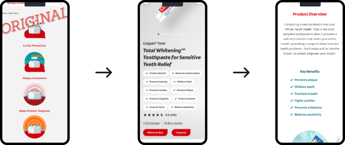
- Designed contextual product recommendations based on user intent
- Reduced hard CTAs in favour of soft, educational transitions
- Clarified when users were “learning” vs “shopping”
Introduced User Testing to Stakeholders
Stakeholders were skeptical of research, so I:
- Started with lightweight usability testing
- Shared direct user quotes and recordings
- Tied findings directly to conversion metrics
This shifted how decisions were made across the project.
Impact & Reflection
- Navigation engagement increased significantly 0.98M → 2.1M users per month
- Conversion from articles to products improved from ~1.8% to ~4.7%
- Lower bounce rates from educational pages
- A scalable IA adopted across 70+ global markets